Unlocking the Secrets of the XRP Chart: Your Guide to Ripple’s Performance
Understanding the XRP chart is crucial for anyone looking to grasp Ripple’s market dynamics. This article offers a deep dive into XRP’s performance, providing insights on its historical trends, current status, and potential future movements.

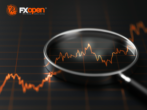
In the ever-evolving world of cryptocurrency, keeping a close eye on market trends is essential for investors, traders, and enthusiasts alike. Among the plethora of digital currencies making waves, Ripple’s XRP stands out for its unique infrastructure and promising potential for global financial transactions. The XRP chart, a graphical representation of its price movements over time, serves as a vital tool for understanding the cryptocurrency’s performance and market sentiment. This article aims to demystify the XRP chart, offering readers a comprehensive guide to interpreting its fluctuations and what they signify for the digital asset’s future.
XRP, developed by Ripple Labs, is designed to facilitate swift and cost-effective international money transfers, distinguishing itself from other cryptocurrencies that prioritize decentralization over speed and transaction cost. The utility and efficiency of XRP have led to significant interest from financial institutions and investors, reflected in its market performance and price dynamics captured in the XRP chart.
Analyzing the XRP chart requires understanding its components—price axis, time axis, volume bars, and sometimes, technical indicators. The price axis (vertical) shows the value of XRP in fiat currency or other cryptocurrencies, while the time axis (horizontal) represents the period over which the prices are displayed. Volume bars, often found at the bottom of the chart, indicate the number of XRP units traded within a specific timeframe, providing insights into market activity and sentiment.
Technical analysis is a common approach to deciphering the XRP chart, involving the study of past market data, primarily price and volume, to forecast future price movements. This method employs various indicators and patterns, such as moving averages, resistance and support levels, and trend lines, helping traders make informed decisions based on historical performance trends.
Moreover, understanding the factors influencing XRP’s price is crucial for interpreting its chart accurately. These include overall market trends, regulatory news related to cryptocurrency, technological advancements within the Ripple network, and partnerships or endorsements from significant financial institutions. For instance, announcements of banks adopting Ripple’s payment system can lead to a surge in XRP’s value, which is often reflected in steep upward movements on the chart.
However, it’s important to note that, like all cryptocurrencies, XRP’s market is highly volatile, making its price susceptible to rapid changes. This volatility is depicted in the chart’s peaks and troughs, highlighting the risk and potential rewards of investing in XRP. Consequently, while the XRP chart provides valuable insights, it should be one of many tools used in making investment decisions, complemented by fundamental analysis and keeping abreast of relevant news and developments within the crypto space.
In conclusion, the XRP chart is a window into the cryptocurrency’s market performance, offering a visual representation of its price history and current trends. By understanding how to read and interpret this chart, individuals can gain deeper insights into XRP’s potential for investment and its role in the broader landscape of digital currencies. Whether you’re a seasoned trader or new to the cryptocurrency world, mastering the XRP chart can equip you with the knowledge needed to navigate the complex and dynamic market of Ripple’s XRP.